 Revolver's- Shank snapshot
 YOA's (Our)- Estate of mind
These are the selected few snap shots from ours and revolver’s production. It show different views of our film compared the film 'shank' which all branch from the same subject genre.
Revolvers- 'Shank'
1. This is a shot of revolver's production logo, whilst very simple it have some level to edge of it and is a well known logo to the young adults as they are theirs and our target audience. The colours chosen are very plain as the name of the production itself is very self explanatory plus it is very cost effective and show money was used to improve their production and cause an effect that draws in the target audience.
2. the second shot of their film is where the main iconography of the film is shown by example the crime and violence shown in this shot is very self explanatory and the idea of the film is also shown- Black on Black crime in this one shot you can pull so much from it, for example the fact that all characters in this one shot is Black and all wearing black or very dark colours which highlight the stereotype of black British youths in society the clothing symbolises the dark mind setting that they might have it is also a connotation of death sorrow danger and fear- darkness the fear of the unknown as we may say.
3. Shot 3 is the party scene which is very familiar to the target audience once again interacting with them and louring them in. Compared to most of the shots it is the most colourful shot where it seems that people are enjoying themselves that the atmosphere is most settled. Once again the target audience is drawn in by the artist shown in the shot it a well know grime artist.
4. the forth shot is a where the two main protagonists are introduced the two brothers you can tell that they have a good relationship from the body language that they are both showing, not just that but also the atmosphere is very clean and safe the lighting in this shot is high key which removes and tension and negativity from the shot.
5. This is Cleary the shot showing the title. The actual opening the typography is used with the motion of the words, filtering with the scenes. The title is very plain using neutral colours of beige and black so it doesn’t give away much of the genre. That only thing that gives away some of the plot is the silhouette of a character with weapons in the persons hand to form the shape 'A'. The title itself gives away the plot in a way that the target audience would understand- 'Shank' being a London Slag term for Stab (assault).
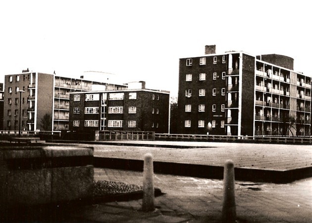
6 & 7. These two shots are both location shot but one tell the plot more than the other. Sjot 6 is a shot of the traditional London bus making it easy to guess what the location is, being London. It is in a high key shot so the location is shown properly to give a clear interaction of where the film is set and possibly the time setting. Shot 7 shows the estate which is a different side of London it shows the poverty side of it- a rundown estate compared to the traditional London bus in a better classed area.
8. This shot is the whole theme- genre of the film in one show this is a very powerful shot were you have some of the characters from which you can look at them and tell exactly how they are how they may behave. you automatically know that they are up to trouble and that there are people that you show be scared of from the dark clothing to the dark bandanas which covers most of the faces so there identity is unknown. This shot fits the stereotypes that go with young black males in London.
9. Finally this last shot is also very powerful connection shot where there is a close up on a characters hand which blood is dripping from it. There is so many things that you can take from this shot from where the blood is an obvious connotation of death, loss and pain. The hand is shown to be a child’s hand so there is so many situations that you can put that in from; a child loosing someone close or a child probably being involved in something deadly and so on. And the clash of the high key lighting and the shocking image its shows to some extent that light overpowers the darkness or a revolution has been encountered where the battle may have ended and all is at peace.
YOA’s- Estate of mind
1. The first shot is a connection shot where there is a close up of vodka being poured in to three shot glasses and overflowing but using premier pro to had effect so we changed the colour to reverse black and white, and reversed the motion of the vodka being poured and it looked as if the drink was being poured back into the bottle. This looks gives it a spy gangster kind of genre to it which confuses the audience which is what we want (enigma). In this way it draws the audience in our film making them want to see want happens.
2. The second shot is a confrontation shot between two youths this is when the genre becomes a little clearer and you can tell by the clothing worn by the characters and the colours used. The lighting is not that high but not that low either, you can still sense the tension in the shot but not an exaggerated scenario where low key lighting is used.
3. This is one example of the title shots and is pretty much the best way we used to show the genre. The mixture of smoke and blood floating in the titles show danger and crime to some level and the soundtrack also goes with the flow of the movement and the flashing around the words go with the beat, this makes to clear to the target audience that it is a UK drama which specifically draws in our target audience most importantly.
4. Once again in this shot we see the vodka but instead of it pouring out alcohol, it is a connection shot of just the bottle using premier pro we switched the colour to black and white and added a feature which blurs the view of the shot this gives it a drunken look which is a stereotype of teenagers (always getting drunk). This shows that the film goes out to teenagers as they may understand it more than others.
5. Here we have the main title-‘Estate of mind’ the font is very sleek and add some kind of class to it but instead of smoke and blood it is just blood flowing through it symbolising death but is you are to look closely to the arrangement of the blood the gap in between shows a cross which symbolises Christianity which is the saviour at the end of the production. The title can be mistaken for a thriller/horror but since we had put it last in the opening sequences by then the audience should have already figured out the genre.
6. Shot 6 is the establishing shot of the location. Even though it is only a skyline of the city we specifically chose to shoot it in the dark so it shows that once the sum is gone all the crimes arrives foreshadowing that something bad may be happening.
7. This shot is a ‘Jamming’ shot which in slag means small gathering shot where alcohol and drugs are consumed this is where the character is introduced and she in is a state the effect also show that drunken blur to have perspective of the character and how they may be seeing the situation. This may also attract young adults as, stereotypically that is what most teenagers do, and it is just that we exaggerated the scene.
8. This is another connection shot with the close up of the lips with reverse smoke it was a good shot to give the production some edge it was a pretty dark shot as we didn’t want to reveal who the character was and gave it that kind of old fashioned spy genre to it but with the music it was clear that it was UK drama the shot was very edgy and make it look slyly action kind with it giving the kind of Charlie’s angel look.
9. The last shot was a split screen showing all the main characters of the film and it gave some atmosphere to the production even though it was black and white it was still high key lighting so all emotion and body language was shown to the audience.

No comments:
Post a Comment